Thursday, 7 April 2011

Feedback


What Music Genre Do You Think This Magazine Is From Looking At The Front Page ?
Person 1 - Rap.  Person 2 - Hip hop.   Person 3 - Grime.
Do You Think The Language Fits In With The Genre Of The Magazine?
Person 1 - Yes.  Person 2 - Yes.  Person 3 - Yes.
Do You Think My Magazine Appeals To The Target Audience? Which Is Mainly males Between 14 - 25
Person 1 - Yes.   Person 2 - Yes.   Person 3 - Yes.
Do You Think You Would Find My Contents Page And Double Page Spread In a Proper Magazine Of This Genre?
Person 1 - Yes.    Person 2 - Yes.    Person 3 - Yes.
Would You Buy My Magazine And Why?
Person 1 - Yes, if it was resonably priced, about £3.   Person 2 - No as im not interested in this genre of music.   Person 3 - Yes, because it looks visualy appealing to me.

Evaluation

My Evaluation has been done on a seprate powerpoint.

Wednesday, 6 April 2011

Media Magazine Double Page Spread.


With my double page spread I have followed the code and convention from VIBE magazine placing a full page image on the left side of the spread. I feel my image is strong because I dressed my subject in a "hip" and modern style of clothing. I choose to dress him and style him in a way my target audience can relate to. A checkered shirt is common today I my self were them alot and big watches and bling to show his wealth and inspire, because people between the age group 14 - 24 year olds, which is my target audience, all they want is money and nice things. Composisition of the subject is important to, as him being smack bang in the middle of the frame would have created lots of negative space which is unimportant. So I just shot my subjects upper body,with the face showing an expression that gives mood and feeling to the image. I broke the code and convention of the placement of the quote which is not useuaully on the image, but due to limit space, as I have only done my article on 2 pages unlike VIBE who use 4, I choose to place it on top of the photo, but i followed the code and convention on useing a quote as the use of it will make the viewer want to read more and know more about the artist. I followed the code and convention of the placement of the logo and use of it, this is to help remind the viewer what magazine it is and promot it, also I used the colour black on it to fit in with my colour scheme. The placement of a page number next to the logo, follows codes and conventions of VIBE to. The page number is usefull as it will help the buyer to quickly find what article they are looking for. The bold lettering that is the artist name is also A code and convention of VIBE it is allways there initails or if there name is short, the name. The first letter is allways black and the following a colour that relates to the subject. I have used the blue of the subjects shirt, which also fits in with my on going colour scheme of my magazine. The layout of the text, that follows the artist's name, The name of the article and the introduction to it, is layed out like in the magazine so it follows the code and conventions of it to. I also placed my name underneath the introduction to help make it look professional, like they do in the magazine, to let the viewer know who conducted the interview. Lastly, I came up with the interview my self and wrote it out using Rockwell, which is the font I choose to use through out my magazine, but i broke the code and convention of VIBE magazine laying the interview out in collums as mine would not fit all on one page like this so I just placed it as a block of writing fitted around the image.

Double Page Spread - Article

I wrote my feature on how my made up artist has came to fame and had to work for it. I did it like this as i felt the viewer could relate to it more this way, because most people have to work for what they want.

   "Dee’s new album comes out this week and with his 3 number 1 singles already this year, his debut album is tipped to
   top the christmas charts this december. Knowing all this, us at HYPE have managed to track Dee down for an exclusive interview about his debut album and his rise to fame on top of the UK Grime scene. HYPE asked Dee about how he managed to come from nothing and gain everything in a year. Dee answered:
   “well practise was everything ya’no, me and my man DJ Skee were making mixtapes in his cellar from back in the day, ya’no , when we was like 14. We kept making them and making them till we was like, I dunno, 17 - 18 and this guy from this record company found me rapping in a battle against Devlin, you know him ? everybody knows Dev, done some big things this year.”
“Yer his new albums good” I answered.
   “Yer man, let you hair down in London city, ha, but yer, the record guy said bring ya’ tapes and come down to the company, which I did and I got signed, this was around like... 2006.”
“So how comes it took you 4 years to get your album out?” I asked.
   “The fools at the album company would’nt push my album saying that this S**T would’nt sell and that, but all I can say is who’s laughing now! I left them after about a year and a half and went to saty with my mate DJ Skee who had a massive set up in his yard in America. We stayed up all day and night perfecting my tracks, re-writing verse’s and song’s and also writing new tracks. We did this till we thought we had made a massive killer album, but me and Skee thought bigger tryna’ find a record label to back it. At the end of 2008 abd the begginning of 2009, Warner music group signed me to back the album they loved it and thought it could be the new sound of 2010.”
“They were right The Project is being called already the biggest and most anticipated album of 2010 and with 3 number2’s under your belt, your the one everyone is watching! and your only 21! Enjoying the presure?” I asked.
   “Haha im loving it Bruv, I shine under pressure! Haha but narr bruv it’s been hard and all that but know im on top and everyone knows it!”
“Well not giving much away but on page 110, HYPE have put together A list of the top 25 singles and albums of the year and you have done pretty well.” I stated.
   “Ahhh have I? Well I am great... Ha narr yer the album, well Warner signed us and the album still had no name but they hooked me up with everyone I calaborated with on it, which realy helped improve the album. They got Tinie, Jodie Conor, Wiley and everyone else on there to come and record. It was so much hard work man, but it was so worth it. I mean I was in A club the other week just jamming to a remix of my song and just seeing everyone going mental over it was just amazing man, amazing, words can’t describe ya’no.”
“How did you pick the name in the end?” I asked.
   “Ahh well it just came to me, I was like the road, narrr, Troubled times PSSSSHHTT, The Project, yer man that sounds good ! but like I have said it’s been a long journey and it’s been hard but its all been so worth it...”
  

Tuesday, 5 April 2011

Double Page Spread - Artists name

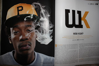
VIBE magazine use lettering like this to head there articles about the artists. They are userually the artists Initial from their stage name. The coloured letter is allways a colour that best represents the artists so the yellow in Wiz Khalifa's one is the same yellow from his hat and also the pitburgh stealers (An American Football Team) team colours, which is the subject of his song Black & Yellow. I have decided to use this code and convention because I feel like this looks appealing to my target audience and will work realy well with the name I have give my artist.

I the name Dee for my artist. I followed the code and convention of having the initails or if its a smallname placing that at the begging of the article. The blue relates to my subject by being the blue from the subjects shirt. The colour blue also fits in with the colour scheme of my magazine which is Blue, White & Black.

Double Page Spread - Logo / Page Number

To make things easyer for the viewer VIBE place a page number next to there logo at the top of the page. This makes it easy for the viewer to quickly look at what page the article they want is on, on the contents page and then quickly find what they are looking for. I have used this code & convention as i feel like page numbers is good because it makes it easyer for the viewer and the placement of the logo reminds the viewer what magazine they are looking at.

Double Page Spread - Image

VIBE magzine use one massive image that takes up one page and then one or 2 smaller images through out the articles, which are userually 3 - 4 pages long. I only have 2 pages to fill but I am going to use the code and convention of using one massive image then maybe one smaller image.

This is my main image for the double page, it will be a4 and take up half the page. I have only adjusted the levels ever so slightly on photoshop to improve the image.

This is my second image and will be placed in the bottom right coner of the page. It will be smaller and have the text posistioned around it. I feel doing this makes the image and page as a whole, look more perfestional. Again with this image I just adjusted the lighting levels ever so slightly.


The Background for my double page spread will be white and the background for the images will be used to.


Media Magazine Contents Page.

With my contents page I have followed all the code and conventions VIBE use on there one. I placed the image on the right hand side of the page and had all the wrighting down the left of the image, I used Rockwell Extra Bold and Rockwell as the Fonts. With the image I used a different subject. I used a different made up artist, which i called DJ. this was because his initials is D & J. I used a different subject to help show varation to my images, so you can see that I can use other images within my magazine and it can still flow and follow a continuos theme & be effective at the same time. In the top left corner of the page I have made what i would call a logo, based around VIBE magazines logo which is realtively the same but instead of the V it is a H. I made my logo by taking the H used in my header or title, on my front cover and forming what can only be described as a barcode coming out of it. the web adress is placed in it to help publicise my magazine. The logo it's self is used to help make the magazine memorable to viewer and to promot it.

Contents Page - Features

This is A list of features that feature in my magazine. I have themed them all so they relate to my magazine and based the layout on VIBE magazines layout. I like this layout as its simple and does not look to busy but does'ent look empty, Its informative and fits in with the theme of the magazine, but also slightly orignal as I have not seen this layout in any other magazine around.

Monday, 4 April 2011

Contents Page - Logo


VIBE magazine features a logo and the web adress that features at the top of each page. I think this is quite A good idea as the reader will allways be reminded what magazine this is, so I decided to create my own to be placed at the top of my page's.

Contents Page - Background

The background of my contents page consists of the background of my photograph just like VIBE does with theres.

Contents Page - Image

 This is the image used in VIBE. It is placed on the right hand side of the page so the writing can go on the left. The image shows Bruno Mars doing what he does and represent him very well with a 50 - 60's retro look and retro guitar. This represents him very well as Bruno Mars idol is Elvis Preseley and him trying to look like hes from this era because he wants to be like Elvis himself. Maybe not by dressing and styling his hair like him but being himself and showing his love for him through his music, personality and image.
In my image I try to do the same, but in a different way. I was trying to make the subject look like he has come from nothing and is gaining everything, basically trying to make my photograph say look at me this is what I have done and you can do it to, also I want the viewer to be able to relate to my artist, and the way he is dressed, stood and the look is a very common look of the teen generation of today, I no I find myself doing this from time to time. The strong stance to shows that he is quite head strong and loving his life atm because everything is going so well for him.

Media Magazine Front cover.

This is my Final Magazine cover...
I have used a Obvious colour scheme, which will continue through out my magazine. The colour scheme is Black, White and Blue. I choose the base my magazine on the ever growing UK G music scene because, as i said it is ever growing and vast becoming a huge part of music in the UK and also because it is the part of music i listern to, like and know most about. With my headlines I choose to touch on subjects that are relevant to, "The new grime sound" being because Grime is an increaseingly growing in followers, and biggest hits of 2010 / new artists to look out for in 2011 because it has come to the end of the year and the begging of the next, so theese features would help bring the viewers into the new year and out the last. The point of my subject, "Dee" pointing at you and looking straight at you, was to make the viewer feel like they could conect with the subject and also to help sell the magazine. I have based my magazine around VIBE magazine, useing code's aand convention from there magazine to do this. I feel by doing this I have created A strong composition and front page.

Sunday, 3 April 2011

Contents page

Still using influence from VIBE magazine I am creating my contents page. This is an example of a VIBE contents page. As you can see it ise easly laid out and there is a massive photo of the main article artists with a list of features down the side. I have attempt this sort of style with my contents page, with the H in the background as A posed to the V. I do not like this and feel it does not work as well as VIBE's does. So I have decided to create the contents page like the one from my edition of VIBE which is layed out the same but does not have the V in the back ground.

Saturday, 2 April 2011

Front Cover - Headlines

A big feature of the front cover of a magazine is the headlines. For my front cover i have made up Headlines and main features of the magazine which will be placed on the front cover to advertise my magazine to the public. Theese headline's obvoiusly tie in with the theme of my magazine to. I bassed the layout of the headlines on this cover of VIBE. I used the code's and conventions that they have used, for example, the list of artist across the top of the magazine and the various sized fonts.


Front Cover - Background

On VIBE magazine they use a Monotone back ground, Which i think makes the lettering and artists stand out more. So i am going to use this code and cenvention on my magazines useing a plane monotone back ground to. I worked out the artist were photographed on that dark grey back drop, so with my image I used the white back ground i shot my subject on as my magazines background.

Friday, 1 April 2011

Front Cover - Barcode, Web Adress, Date and Price

There are Four over looked Codes and Conventions of a magazine and they are A Barcode, Web Adress, Date and The Price.
(To the left is VIBE magazine, Barcode, website, Date and Price)
I have broken the convention from VIBE as they allways place the barcode, date, price and webadress on the left hand side of the of the front page, I have chosen the place mine on the right hand side as i do not want the right to cover up the hand.


I will do market reasearch into prices for my magazine, VIBE however costs £3.99, and the paper it is printed on it quite nice and has a higher grade content making it less flimsy  and tougher than NME for example, which has A lower grade content and only costs £2.40. I have decided to price my magazine at £3.99 to as i feel the type of paper will be better and nicer for the custmor.

Front cover - Cover Image


On VIBE magazine there is allways a full page photo of a Muscain or few muscian, who are allways the main feature of the magazine. In my magazine i have followed this code and convention by photographying my mate, Dion and using him as the main featured artist in the magazine, Named Dee. Theese are the images I have taken to be on the front cover, I will only use one of these image for it though.
 I have choosen this image for my title page image. I think this Image is good for this as "Dee" is looking staright at the veiwer and pointing as if to say, You buy me. This is the edited version of the picture that willl be placed on the front cover.

I have editted this image by first adjusting the lighting levels and then just converting it to black and white. I then placed the image on the front cover and rubbed out the background of the image, so i only had my subject left. When photographying this image i put the focus of the camera on the face rather than the hand, even know its in the foreground. I did this because even though he is pointing at you as to say buy this magazine, the face and the eyes espically, is more important because you can still make out the hand it's self, but his face is the main vocal point, other wise custmors would not be able to work out who it is.


Front Cover - Creating my magazine

With starting to create my magazine i looked at the header of VIBE magazine, which i have used as a main influence on my magazine.
Vibe have used a font called Amplitude, which can be brought from this website http://www.fontbureau.com/fonts/Amplitude, unfortunualty I can not afford this and will look for an alternative. It needs to be bold and easly readable, along with "eye catching" so when people look to buy a magazine they will easly notice it. After searching for a font I like, i found Bolt SF.

To help me decide which font i used, i have writen my name in different fonts to see which looks the best.
ALEX – Arial Black
ALEX – Bolts SF
ALEX – Diamond Heavy SF
ALEX – Eras Bold ITC
ALEX – Folio XBd BT
ALEX – Impact
ALEX – Rockwell Extra Bold
My Favioute two was the Bolts SF font which I will use as my header font and Rockwell Extra Bold which i will use as my main text font. In addition to this I may use the basic Arial font to.I choose bold font as I feel this will be more eye catching and striking.