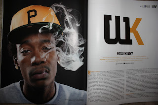
VIBE magzine use one massive image that takes up one page and then one or 2 smaller images through out the articles, which are userually 3 - 4 pages long. I only have 2 pages to fill but I am going to use the code and convention of using one massive image then maybe one smaller image.

This is my main image for the double page, it will be a4 and take up half the page. I have only adjusted the levels ever so slightly on photoshop to improve the image.


This is my second image and will be placed in the bottom right coner of the page. It will be smaller and have the text posistioned around it. I feel doing this makes the image and page as a whole, look more perfestional. Again with this image I just adjusted the lighting levels ever so slightly.
The Background for my double page spread will be white and the background for the images will be used to.


No comments:
Post a Comment